Selecting a countertop color and pattern is more than just picking what you like today—if you’re investing in a quality surface with H A Stoneworks, you’ll want choices that feel fresh for years. The 2026 trends signal some exciting directions for color, texture, and surface movement.
Key Trends for 2026
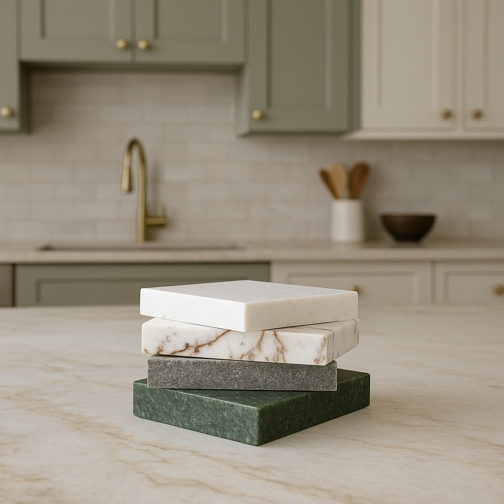
Bold veining and rich color
Designers expect “bold countertops in rich colors with deep veining” to be a major statement in 2026 kitchens. The Spruce Rather than quiet, uniform slabs, look for stones with dramatic movement.
Deep greens, burgundies and expressive hues
While neutrals will still hold strong, colored stone across kitchens is on the rise—deep greens and burgundies are especially notable.
Warm neutral tones
On the flip side, soft warm neutrals—creams, taupes, soft beige and off-white—are also trending for places where calm, gender-neutral elegance is desired.
Slip-matched and large-format patterning
Instead of frequent book-matching or heavy pattern disruption, slip-matched flow patterns and larger format slabs are becoming more popular.
Incorporating texture and layered finishes
Texture matters: matte finishes, honed surfaces, and integrating subtle sparkle or natural stone variation help surfaces feel tactile rather than flat.
How to apply these trends with H A Stoneworks
- Request sample slabs or full-slab mockups so you can see how color and veining flow across seams or in your lighting.
- If you want a statement island, ask about richer colors and heavy veining; for perimeter counters, you might choose warm neutrals for balance.
- Consider how cabinetry color, lighting (both natural & artificial), and backsplashes will play into your countertop choice.
- Make sure the slab you choose works in your space long-term, not just because it’s “in trend” now.
Recommended Product
For color exploration, consider ordering a sample like the Silestone Quartz Countertop Sample – this gives you a hands-on feel of color, pattern and finish.
Expect a mix of bold and subtle: deep greens and burgundies for focal points, warm neutrals and creams for broader applications, and strong veining for drama.
Yes—but only if it aligns with your overall aesthetic and you’re comfortable committing. Dramatic veining makes a statement but can dominate the space.
Absolutely. Warm neutrals are trending for their timeless appeal and ability to pair with many styles. They offer longevity and flexibility.
Slip-matched large slabs and a consistent flow of veining are preferred over heavily mirrored book-matched designs
Lighting can change how color and pattern appear—warmer lights make warm tones richer, cooler lights can subdue bold colors. Always view samples in your actual space.